Introducing Appellation's new packaging – hero green, sustainable paper, and design details inspired by Czech heritage.
This new identity marks an evolution for our brand and the sensory world we've created – melding design and functionality with a slower, more intentional approach to self-care.
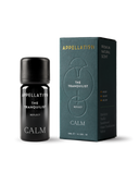
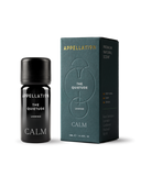
At the heart of the new look is Appellation's hero green. Grounding and elegant, this shade is inspired by Prague's Art Nouveau architecture – fusing the classical with modern sensibility and the richness of nature.
Timeless geometry
Every carton carries a new design element: motifs inspired by timeless geometry and architecture.
Minimalist, refined – motifs with meaning.
Drawn from a custom pattern using three primary shapes from the Appellation logo, these details appear subtly across our collection – a quiet mark of our story, and the care and intention behind every formulation. On occasion, pared-back vertical motifs replace the full pattern – clean, uncluttered, and quietly striking.
Silk-printed typography
Silk-printed typography – a considered choice for sustainability and minimalism.
Typography has been refined too. Silk-printed directly onto our biophotonic glass bottles, it removes the need for labels – reducing waste while allowing the design to shine. A clean serif font introduces an understated elegance to our brand – minimalist, refined, and enduring.
Sustainability, considered
Appellation has always favoured natural, responsible materials. For our new look, we selected Favini Shiro Echo Bright White – a high-quality paper made from 100% recycled fibres.
Shiro Echo paper is FSC™ certified, recyclable and biodegradable.
The paper is produced using renewable energy and offsets unavoidable emissions. Its subtle texture proves that sustainability and luxury can exist in harmony.
In detail – subtle texture and debossed motifs, accented with a touch of gold.
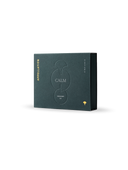
On the front of each box, debossed motifs add tactility without overwhelming the minimalist aesthetic. A refined gold foil brand mark and logo bring a final layer of understated elegance. The unboxing experience has been reimagined too – soft neutral interiors, hidden patterns and a message create a subtle element of surprise and discovery.
A fragrant evolution
Alongside our new design, two of our signature blends – The Tranquilist and The Quietude – have been subtly reformulated.
Some subtle enhancements – more balanced, more beautiful.
Their compositions have been rebalanced to enhance presence, performance, and harmony, resulting in fragrances that feel even more resonant and beautifully composed. More balanced, more fragrant – and as always, designed to bring clarity, intention, and a little everyday beauty to your space.






The Art of Design: A New Chapter for Appellation
Introducing Appellation's new packaging – hero green, sustainable paper, and design details inspired by Czech heritage.
This new identity marks an evolution for our brand and the sensory world we've created – melding design and functionality with a slower, more intentional approach to self-care.
Hero green, honouring heritage
At the heart of the new look is Appellation's hero green. Grounding and elegant, this shade is inspired by Prague's Art Nouveau architecture – fusing the classical with modern sensibility and the richness of nature.
Timeless geometry
Every carton carries a new design element: motifs inspired by timeless geometry and architecture.
Drawn from a custom pattern using three primary shapes from the Appellation logo, these details appear subtly across our collection – a quiet mark of our story, and the care and intention behind every formulation. On occasion, pared-back vertical motifs replace the full pattern – clean, uncluttered, and quietly striking.
Silk-printed typography
Typography has been refined too. Silk-printed directly onto our biophotonic glass bottles, it removes the need for labels – reducing waste while allowing the design to shine. A clean serif font introduces an understated elegance to our brand – minimalist, refined, and enduring.
Sustainability, considered
Appellation has always favoured natural, responsible materials. For our new look, we selected Favini Shiro Echo Bright White – a high-quality paper made from 100% recycled fibres.
The paper is produced using renewable energy and offsets unavoidable emissions. Its subtle texture proves that sustainability and luxury can exist in harmony.
On the front of each box, debossed motifs add tactility without overwhelming the minimalist aesthetic. A refined gold foil brand mark and logo bring a final layer of understated elegance. The unboxing experience has been reimagined too – soft neutral interiors, hidden patterns and a message create a subtle element of surprise and discovery.
A fragrant evolution
Alongside our new design, two of our signature blends – The Tranquilist and The Quietude – have been subtly reformulated.
Their compositions have been rebalanced to enhance presence, performance, and harmony, resulting in fragrances that feel even more resonant and beautifully composed. More balanced, more fragrant – and as always, designed to bring clarity, intention, and a little everyday beauty to your space.